🕶

I'm Richard, owner of Rediseños. I focus on creating first impressions and building meaningful relationships.
🕶

I'm Richard, owner of Rediseños. I focus on creating first impressions and building meaningful relationships.

🕶

I'm Richard, owner of Rediseños. I focus on creating first impressions and building meaningful relationships.

Highlights
Portfolio
History
Let's Work!
Highlights
Portfolio
History
Let's Work!
Highlights
Portfolio
History
Let's Work!
The FIFA Men's World Cup

UNITED 2026

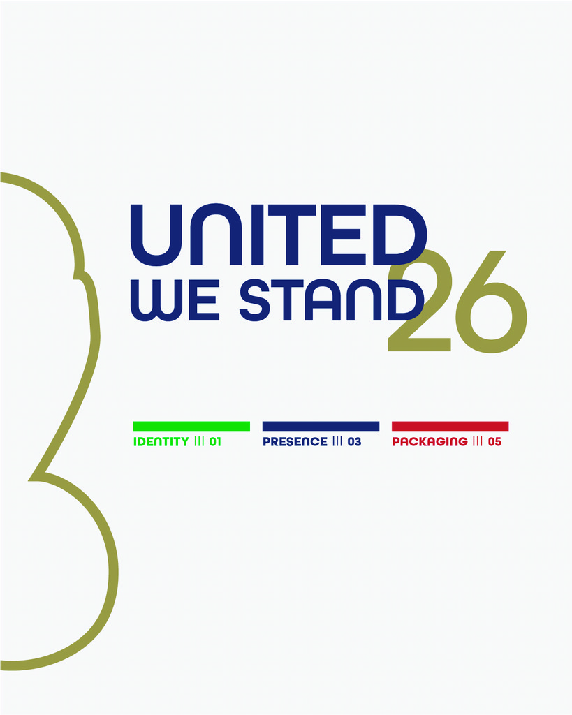
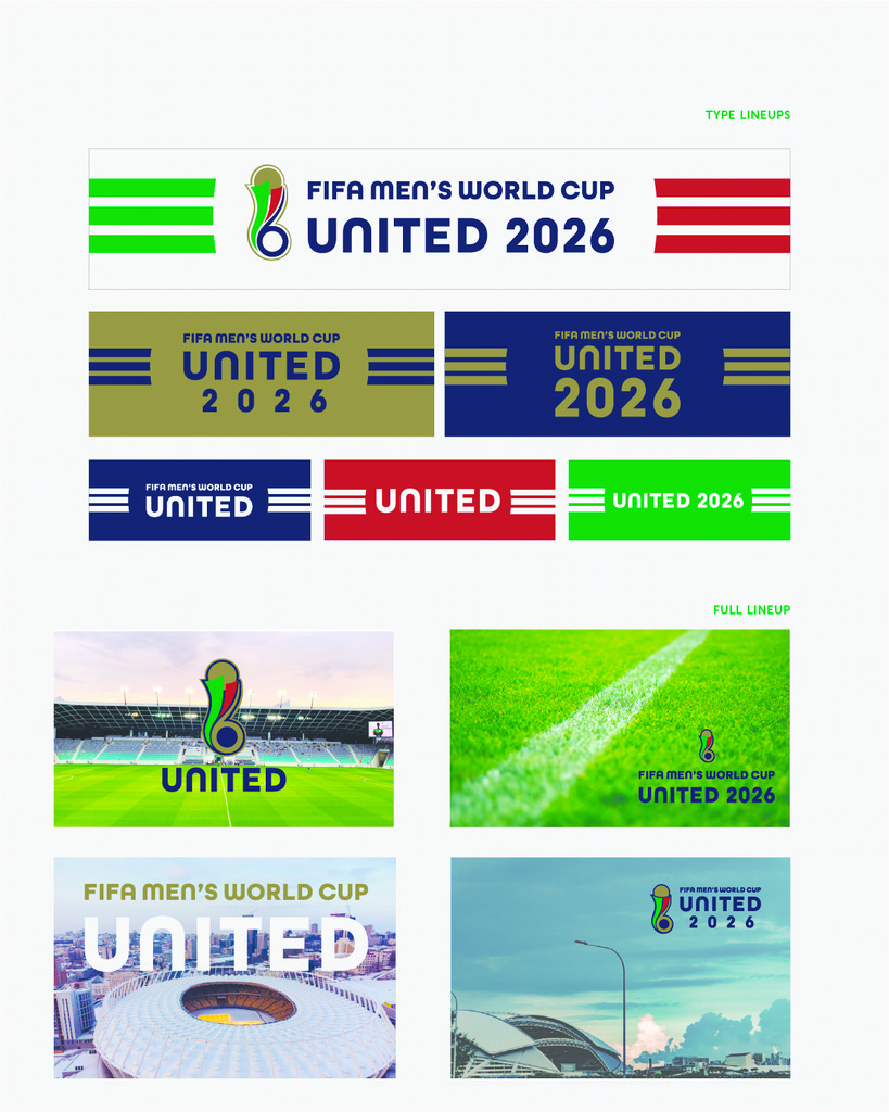
The UNITED Bid was selected by FIFA to host the Men’s World Cup in 2026. This will be the first time that three countries will host such an event, and will feature Canada, USA and Mexico as hosts for this global spectacle. I challenged myself to build a brand that focused on what the world needs now, Unity.

The UNITED Bid was selected by FIFA to host the Men’s World Cup in 2026. This will be the first time that three countries will host such an event, and will feature Canada, USA and Mexico as hosts for this global spectacle. I challenged myself to build a brand that focused on what the world needs now, Unity.

The UNITED Bid was selected by FIFA to host the Men’s World Cup in 2026. This will be the first time that three countries will host such an event, and will feature Canada, USA and Mexico as hosts for this global spectacle. I challenged myself to build a brand that focused on what the world needs now, Unity.

Revealing The Identity

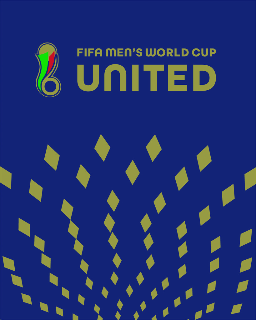
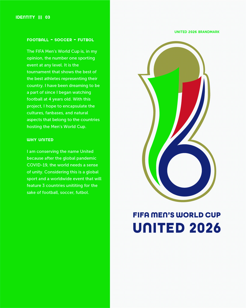
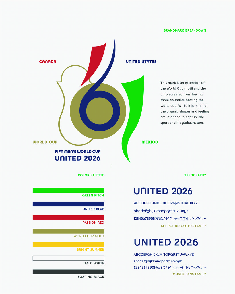
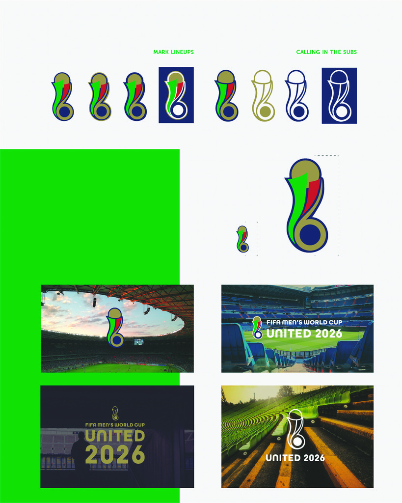
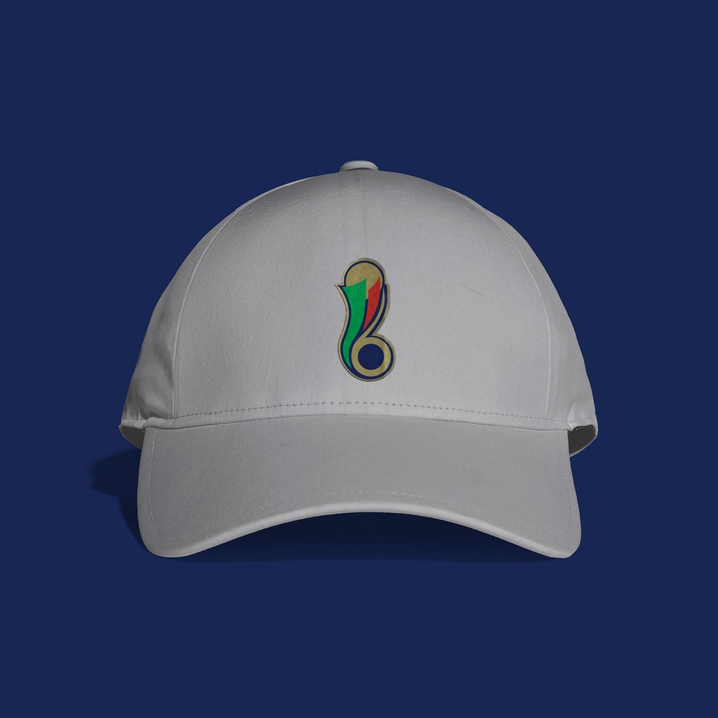
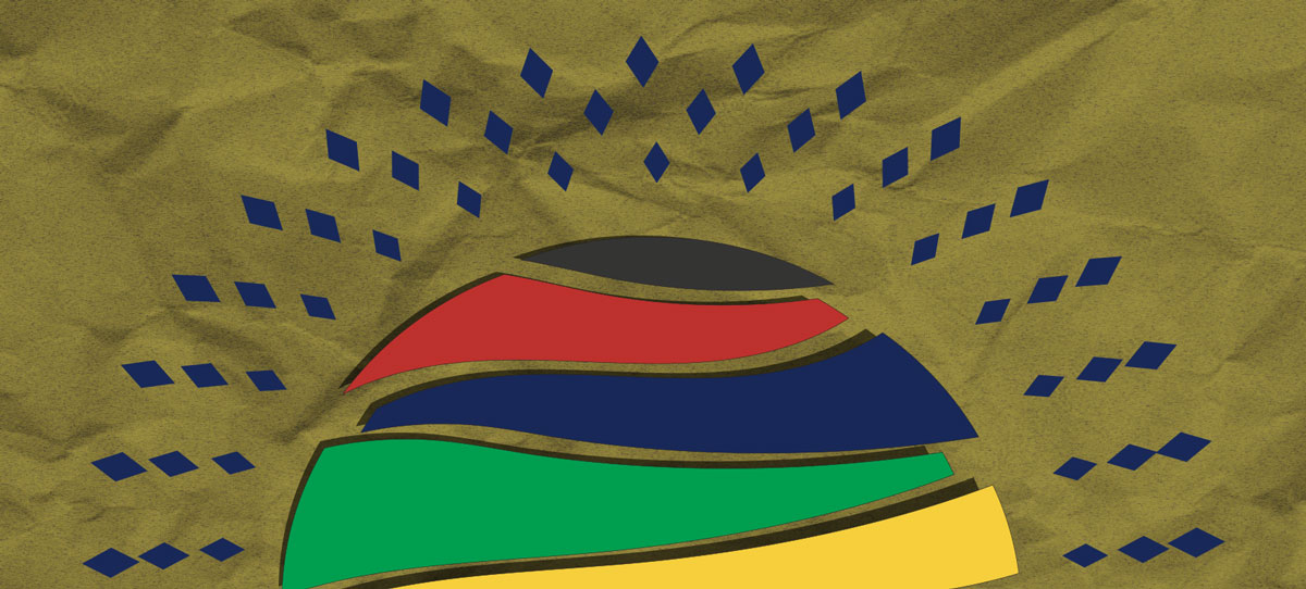
When ideating this process, I decided to keep the name for the bid because the messaging of a brand being United throughout the tournament was one I felt very appropriate considering the global audience this event has. And during the Covid-19 pandemic I felt was a message I needed to ​​​​​​​spread with my work. The mark itself elevated the current motif being used for the Men's World Cup, which happened to be designed in 2002. I not only wanted to step out of that, but in a way also pay homage to the first iteration. I wanted a decorative style in the elements that accompany the logo, however I wanted a bold outlook that could be appreciated by a larger audience.

When ideating this process, I decided to keep the name for the bid because the messaging of a brand being United throughout the tournament was one I felt very appropriate considering the global audience this event has. And during the Covid-19 pandemic I felt was a message I needed to ​​​​​​​spread with my work. The mark itself elevated the current motif being used for the Men's World Cup, which happened to be designed in 2002. I not only wanted to step out of that, but in a way also pay homage to the first iteration. I wanted a decorative style in the elements that accompany the logo, however I wanted a bold outlook that could be appreciated by a larger audience.

When ideating this process, I decided to keep the name for the bid because the messaging of a brand being United throughout the tournament was one I felt very appropriate considering the global audience this event has. And during the Covid-19 pandemic I felt was a message I needed to ​​​​​​​spread with my work. The mark itself elevated the current motif being used for the Men's World Cup, which happened to be designed in 2002. I not only wanted to step out of that, but in a way also pay homage to the first iteration. I wanted a decorative style in the elements that accompany the logo, however I wanted a bold outlook that could be appreciated by a larger audience.

Packaging It All Together

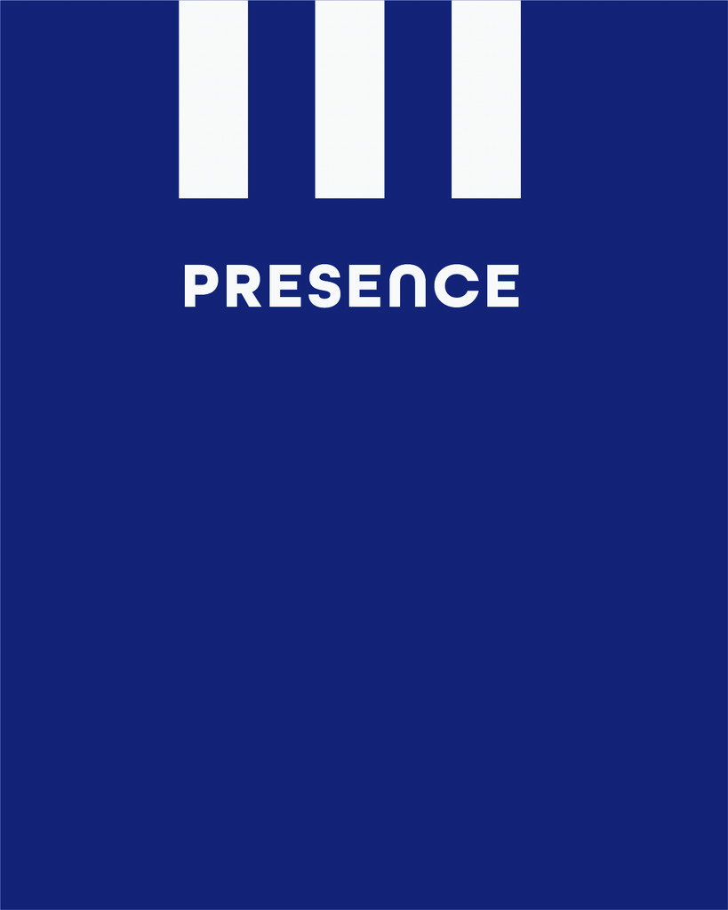
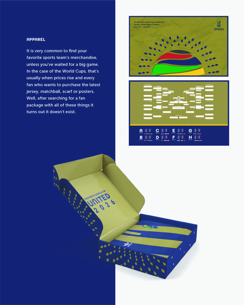
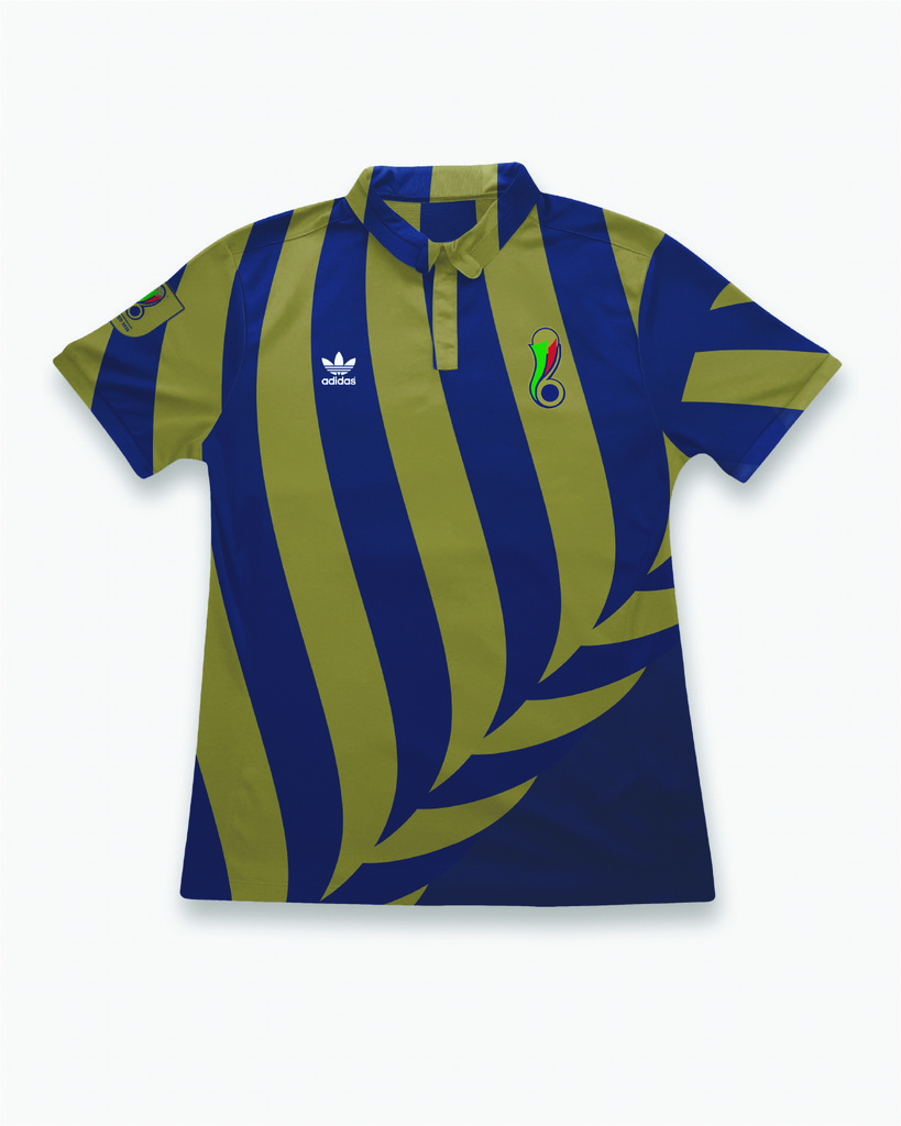
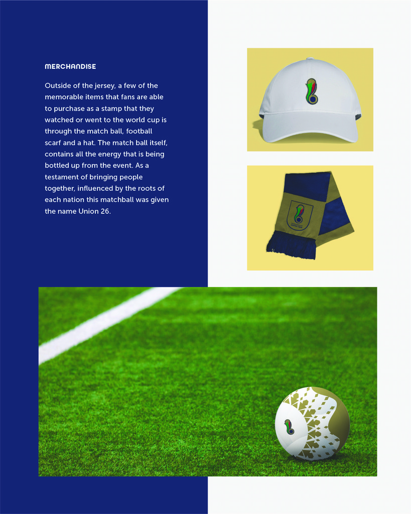
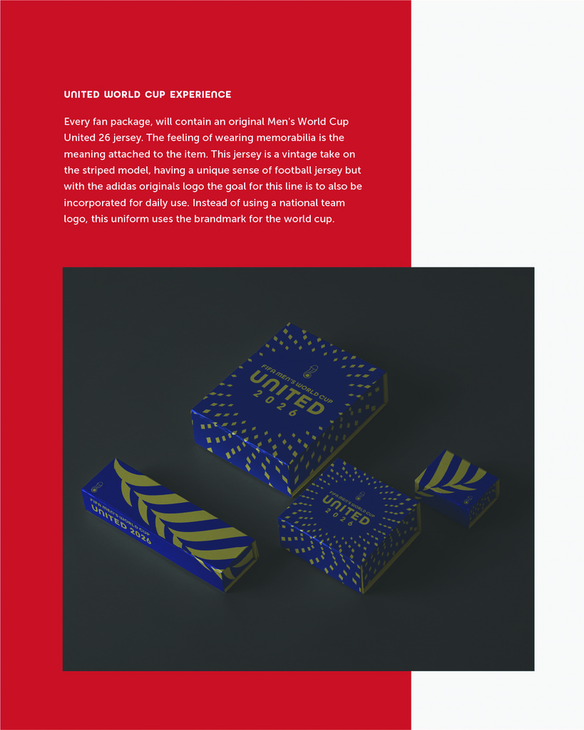
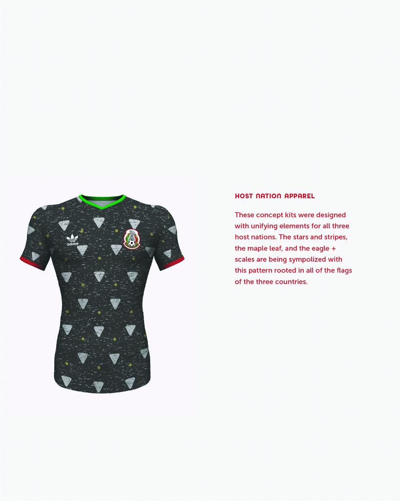
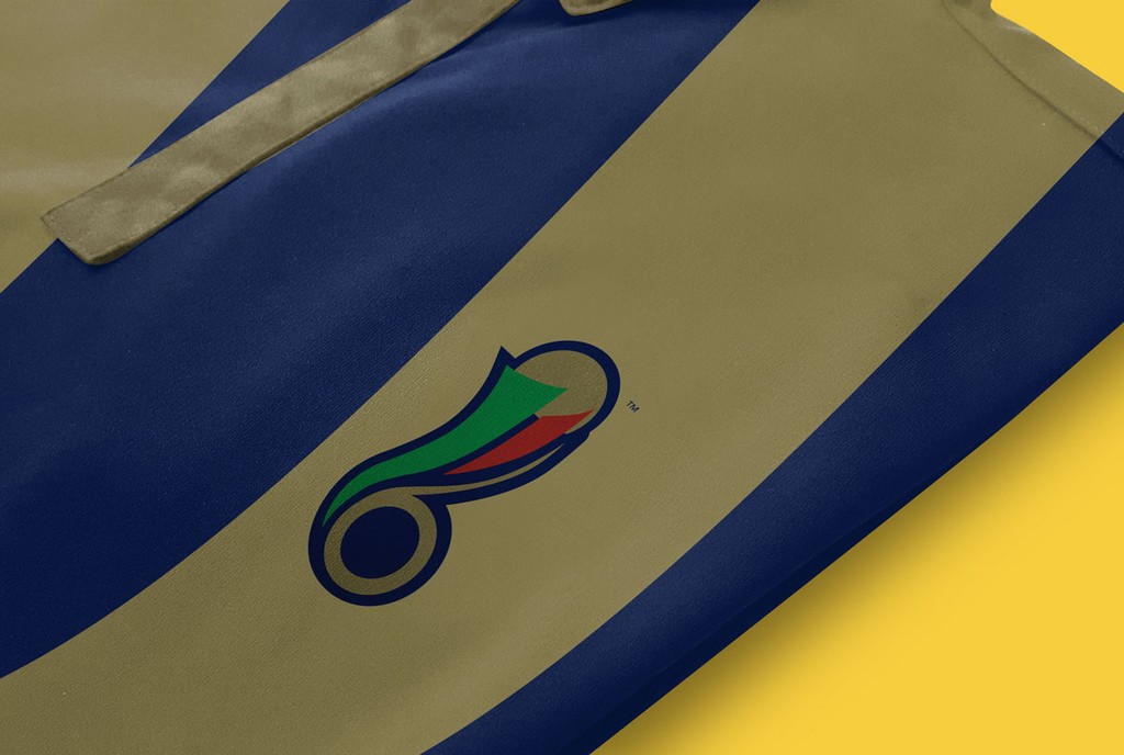
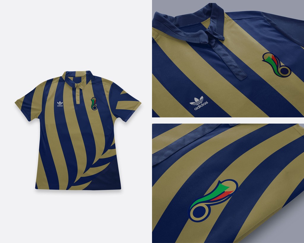
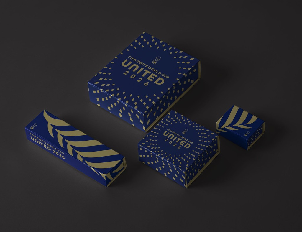
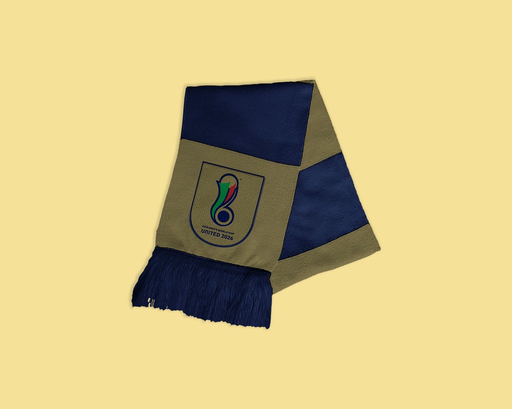
As the identity was taking shape, I was asked to design physical objects or touch points that the audience would benefit from having to remember the brand. I took this opportunity to capitalize on merchandising which would be a great way in my opinion for the audience to feel attached to the brand whether that's through physical objects or advertising. Collector's items are a must. Imagine having a poster, the official match ball and/or a jersey to commemorate the event. What would that look like? Well again here the goal with this jersey is to pay homage to the retro stripes we've seen the host countries in before.

As the identity was taking shape, I was asked to design physical objects or touch points that the audience would benefit from having to remember the brand. I took this opportunity to capitalize on merchandising which would be a great way in my opinion for the audience to feel attached to the brand whether that's through physical objects or advertising. Collector's items are a must. Imagine having a poster, the official match ball and/or a jersey to commemorate the event. What would that look like? Well again here the goal with this jersey is to pay homage to the retro stripes we've seen the host countries in before.

As the identity was taking shape, I was asked to design physical objects or touch points that the audience would benefit from having to remember the brand. I took this opportunity to capitalize on merchandising which would be a great way in my opinion for the audience to feel attached to the brand whether that's through physical objects or advertising. Collector's items are a must. Imagine having a poster, the official match ball and/or a jersey to commemorate the event. What would that look like? Well again here the goal with this jersey is to pay homage to the retro stripes we've seen the host countries in before.

La Copa Is Coming
La Copa Is Coming
La Copa Is Coming

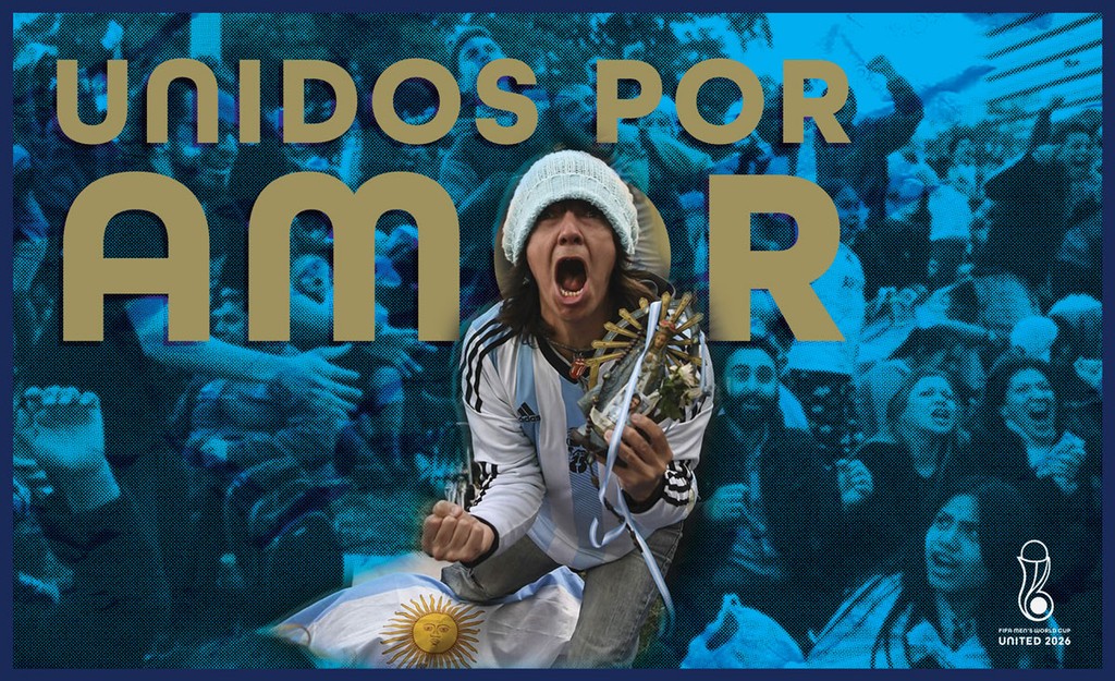
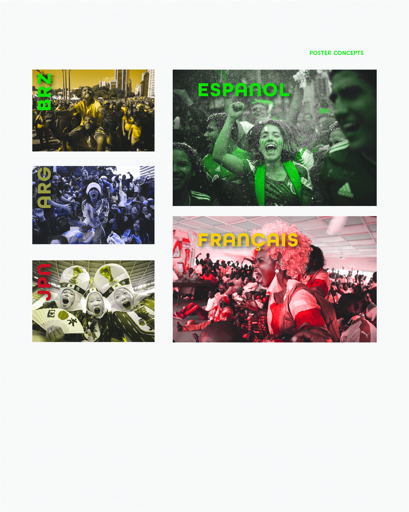
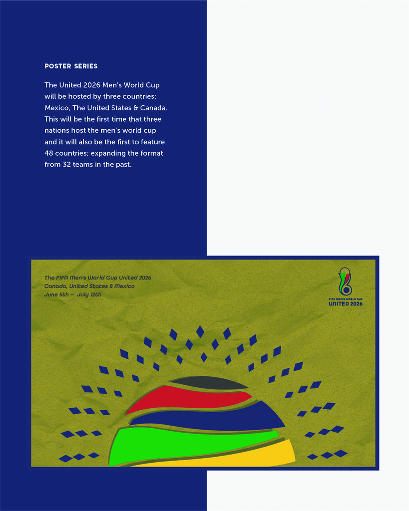
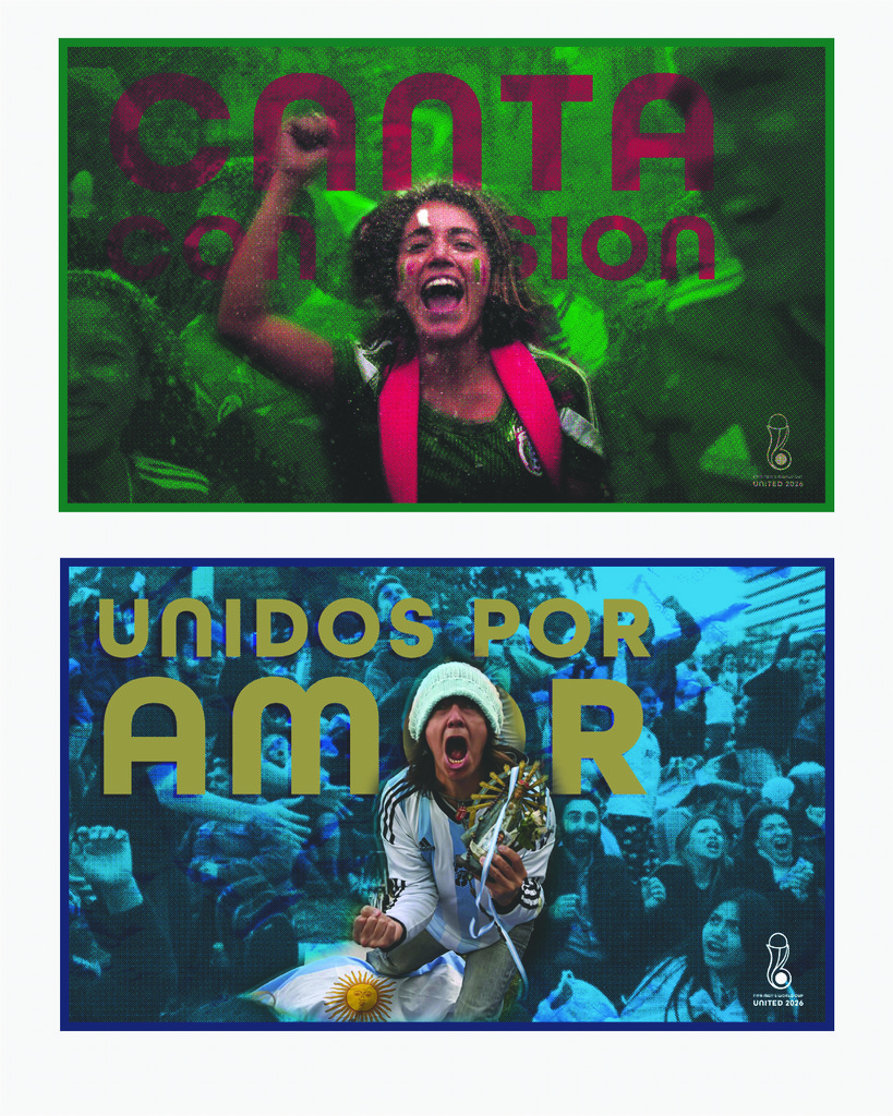
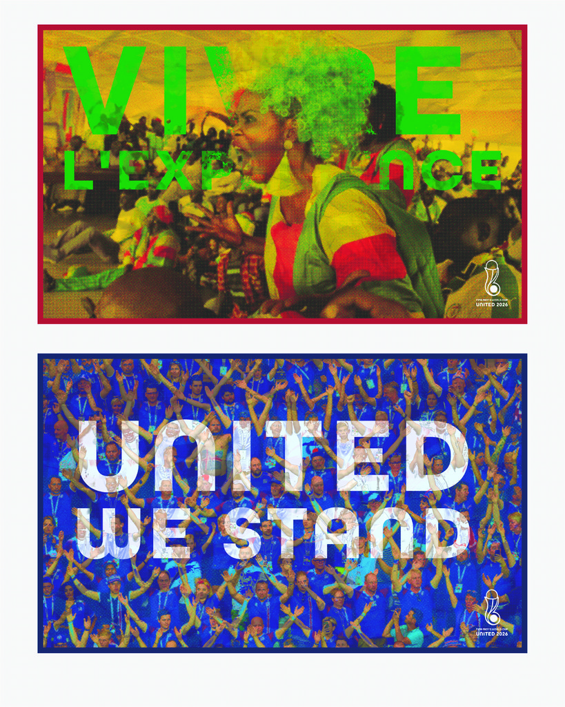
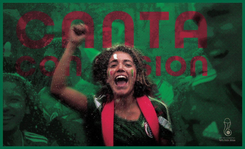
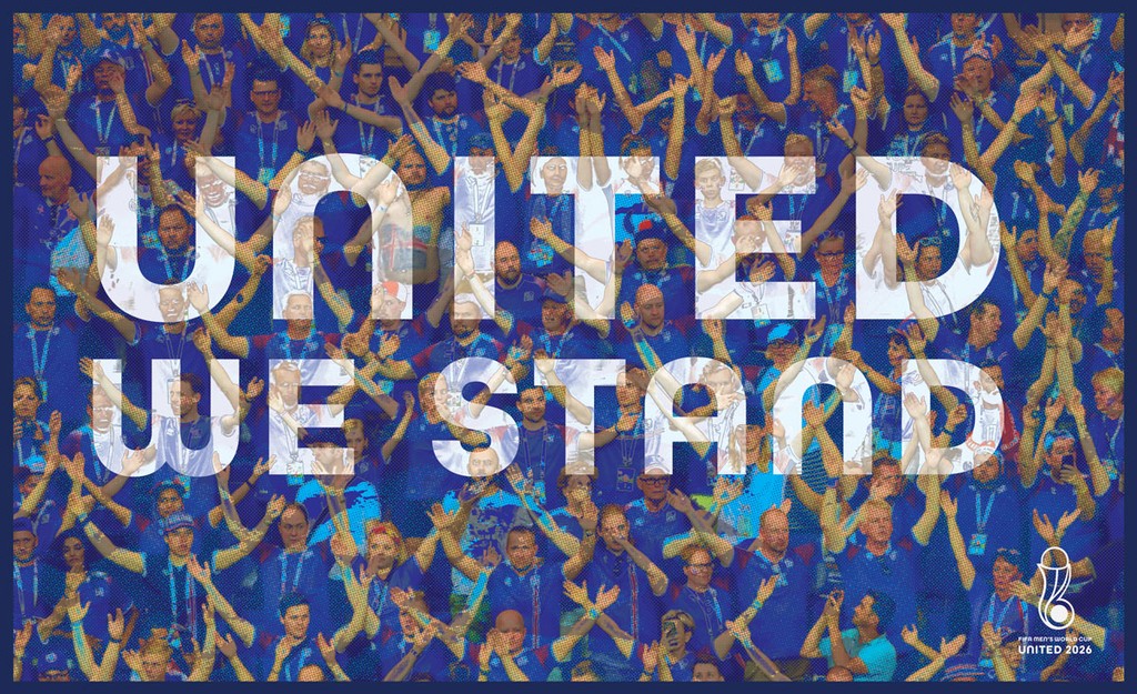
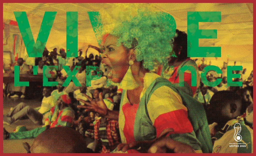
The campaign was created to generate interest for the fans around the world. Being bilingual has allowed me to always feel a little sense of pride when I see promotions around global events that resonate with my audience. Since this is the first world cup with three culturally diverse countries, I wanted to make sure the audiences I appealed had that same sense of pride and unity when looking at these posters. The messaging is bold to invite our audience to participate and be a part of the spectacle that occurs every four years.

The campaign was created to generate interest for the fans around the world. Being bilingual has allowed me to always feel a little sense of pride when I see promotions around global events that resonate with my audience. Since this is the first world cup with three culturally diverse countries, I wanted to make sure the audiences I appealed had that same sense of pride and unity when looking at these posters. The messaging is bold to invite our audience to participate and be a part of the spectacle that occurs every four years.

The campaign was created to generate interest for the fans around the world. Being bilingual has allowed me to always feel a little sense of pride when I see promotions around global events that resonate with my audience. Since this is the first world cup with three culturally diverse countries, I wanted to make sure the audiences I appealed had that same sense of pride and unity when looking at these posters. The messaging is bold to invite our audience to participate and be a part of the spectacle that occurs every four years.

✌🏼 2024 • Made in Framer • Rediseños by Richard Romero
✌🏼 2024 • Made in Framer • Rediseños by Richard Romero
✌🏼 2024 • Made in Framer • Rediseños by Richard Romero
✌🏼 2024 • Made in Framer • Rediseños by Richard Romero